[ad_1]
Today’s Ethereum price chart may suggest the formation of a bearish pattern called the “double top”. 100k ETH also flowed into Binance.
Ethereum Price Chart Shows Famous “Double Top” Bearish Formation
As explained by a CryptoQuant post, the cryptocurrency formed a bearish pattern on the price chart earlier today, and at about the same time, Binance also noticed a netflow of around 100k ETH.
Here is a Ethereum chart that clearly shows the bearish pattern:

ETH's price chart showed a bearish formation earlier today | Source: CryptoQuant
As the above chart shows, Ethereum seems to have formed what’s popularly known as the “double top” pattern. Historically, formation of such peaks has been a bearish signal.
However, a double top can’t be confirmed until the price drops below the support level marked by the dip between the two peaks.
Related Reading | Flash Crash, Ethereum Tests Support With 17% Drop And Risks Further Losses
The above chart was actually posted by the analyst a few hours ago. A more recent version of the chart looks something like this:

ETH's price continues to show volatility | Source: ETHUSD on TradingView
It looks like right after forming the two peaks, the price seems to have crashed down to $3.2k, which is below the 3.3k support level.
In most cases, such a dip confirms that the formation is a bearish double top. However, here the price seems to already be moving back up the support level.
Related Reading | Twitter To Allow Users Receive Bitcoin And Ethereum Via Its Tip Jar Feature
Following a double top event, the support level becomes resistance so that the price stays below it for a while. It’s possible it could just be a shoulder formation, and that the bearish trend might still be active.
Though the opposite could also be true; the price might keep going back up instead. However, another bearish signal also went off…
About 100k ETH Flows Into Binance
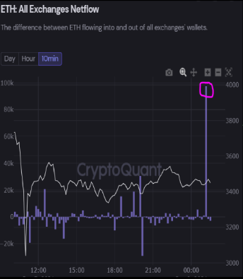
Around the same time that the two peaks formed, the netflow indicator for Ethereum showed that about 100k ETH flowed into the crypto exchange Binance.
The “netflow” is a metric that shows the net amount of coins moving into or out of exchanges. It’s calculated by simply taking the difference between the inflows and the outflows.
When the indicator takes a negative value, it means more ETH is moving out than in, while a positive value implies the reverse.
Here is a chart that shows the Ethereum netflow for all exchanges:

The ETH netflow spikes up | Source: CryptoQuant
The spike on the chart shows that about 100k ETH flowed into exchanges, and chain data confirms it was into the crypto exchange Binance.
Such a positive spike generally implies investors are facing heavy selling pressure, and thus they are sending their coins to exchanges for dumping them.
[ad_2]


